1.2. Visual Design of Plone Web Sites
Plone allows web site administrators and designers the ability to create unique site designs. Here's an overview of the Plone layout, and some design examples.
What does a Plone web site look like? For years there has been a consistent design for the default Plone appearance. The default design looks generally like this:
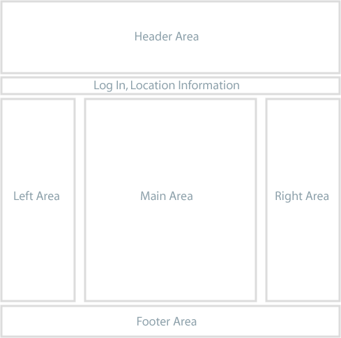
The Plone web site you use could have a design radically different from this, but you should be able to find common elements, such as the log in link and a navigation panel or menu. In the default design, the navigation menu is in the left area, and usually appears as an indented list of folders in the site. There also may be a set of tabs in the Log In, Location Information strip near the top.
We can distinguish between the design of a web site and the functionality of a web site. For getting work done, focus on the functionality and don't worry so much about the appearance and layout of the web site. A strength of the Plone content management system is that a web site can be radically redesigned for a new look, without affecting the underlying content and functionality. The navigation menu can be moved from the left to the right, but it works the same. The right area can be deleted where functionality normally put there isn't needed. The areas for left, main, and right, as depicted above and below, could be changed to top, middle, and bottom, but it would still be a Plone web site underneath.
We'll use the default Plone layout design as an example of typical divisions of the screen:
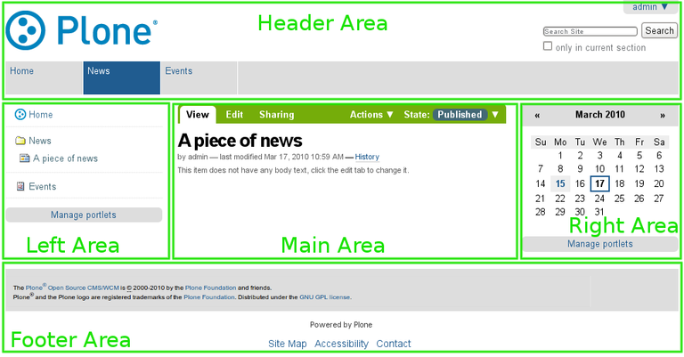
You may need to adapt these terms as needed for your Plone web site design. You may encounter varied terms for describing screen real estate, such as right and left "slots," for the left and right column areas, "portlet," or "viewlet," for discrete areas or boxes, and several other terms.
For example, we can select three web sites from the list of Plone web sites to compare:
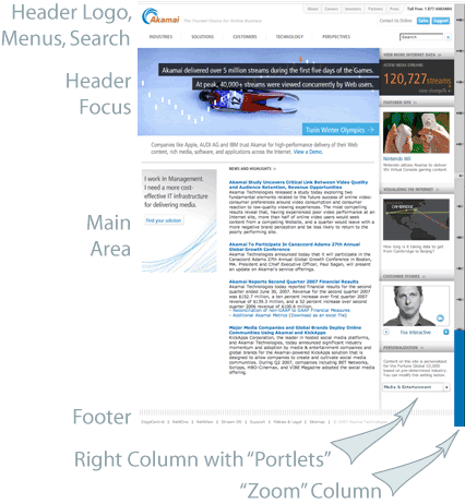
This is the web site for Akamai, a leading provider of online web tools and acceleration technology. The header area has simple text menu choices for five main content areas arrayed horizontally at the bottom of the header area. At right, the header contains another horizontal menu and a search box. The bottom of the header area would contain log in information, for use by the maintainers of the web site. The main graphic at top left is a focus area for eye-catching graphics and current topics. There is a main area at left center where the main text is located. The right column holds a series of "portlets." The footer contains a horizontal menu, repeating the menu choices in the header, for convenience. There is a right-most column that has zoom settings.
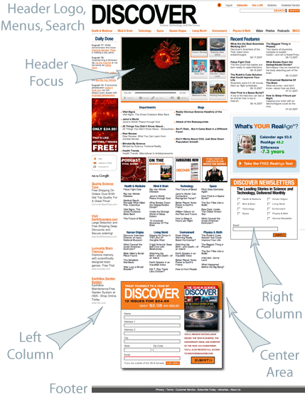
This is the web site for Discover Magazine. The header area contains a large horizontal menu, the "main menu," if you will, a smaller horizontal menu at upper right, and a search box. This site is rich with textual "portlets" that cover so many topic areas, which are divided into three columnar areas, left, middle, and right. The top of the middle column contains a focus area with a video. There are large interactive boxes in several places. The footer contains basic site identification information and a link to "about us." For a large web site like Discover's, maintainers of the site log in to custom editing screens, and there is much automation of data feeds -- Plone uses Zope, a sophisticated storage system, and Python, a great programming language, which facilitates intelligent "wiring" of the flow of text and graphics into the web site.
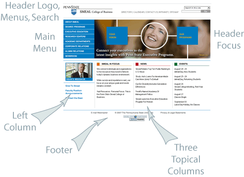
The last of the three sites to examine is the web site for Penn State University's Smeal College of Business. The header contains a logo, a horizontal menu for main topic areas, and a search box at right. There is a main menu for this site at left, which is more traditional for a Plone web site. A large graphical area contains a rolling focus animation. There is another small graphical focus in the left column. Three textual columns round out the design, above the basic identification footer. Maintainers of this web site enter by means of a custom log in page, with the log in and user information showing along the bottom of the topmost header area.
So, what does a Plone web site look like? Traditionally, the out-of-the-box look is like that shown at the top of this page, with header, menu, columns, and a footer. These three sites illustrate how designers typically combine focus areas, vertical and horizontal menus, "portlets," and textual content, usually arrayed in several columns. The underlying machinery is Plone and Zope and Python, but the design "theme" or "skin" can be made to look any way the designer chooses.